The Battle of the Titans "A Tale of FAANG's Trading and Financial Performance"
Compilation of visualized chart
As someone with a passion for understanding the stock market and its inner workings, I've always been intrigued by the performance of some of the biggest companies in the tech industry, known as FAANG. With their immense reach and impact on our daily lives, I began to wonder which of these companies truly stood out from the rest, and what factors contributed to their success or shortcomings. With this in mind, I set out to compare the financial and trading metrics of Facebook, Apple, Amazon, Netflix, and Google (FAANG) in order to gain a deeper understanding of what makes these companies tick and to potentially uncover valuable insights for investors and analysts alike.
To accomplish this project, I needed to collect and organize a vast amount of financial and Trading data from each of the five FAANG companies along with S and P 500 index. This involved extensive research and data mining, as well as developing a system for storing and analyzing the data in a way that allowed for easy comparison and visualization. One of the key challenges was finding a way to graph the price-to-earnings (PE) ratio of each company over a long time period, which required a visualization technique. Despite the challenges, I was determined to create a comprehensive and insightful analysis that would shed light on the performance of these industry giants.
As a data analyst, I knew that this project would require a combination of technical prowess and strategic thinking. So, I set out to gather a vast amount of data on the FAANG companies using codes in Python, while also honing my Excel and Power Query skills to effectively clean and organize the data. However, collecting data was just the beginning. To truly tell the story of FAANG's financial and trading performance, I needed to create a compelling data visualization that would accurately capture the complex relationships between the different data points.
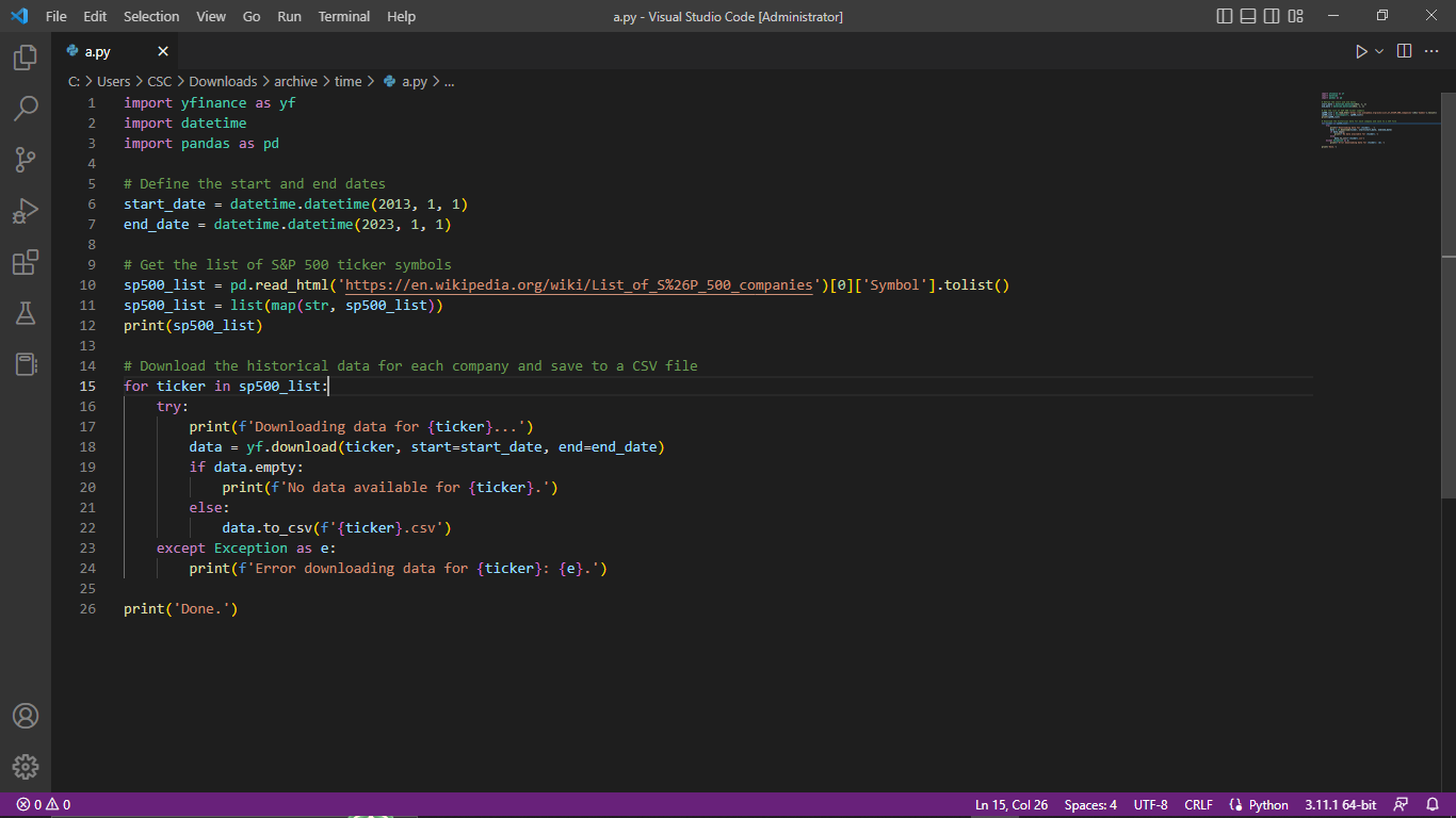
Python code for data scraping
That's where Power BI came in. With this powerful tool at my disposal, I was able to create an interactive and visually appealing data visualization that showcased the performance of each FAANG company over a long period of time. Using my knowledge of advanced visualization techniques such as gauges, cards, conditional formatting and measures, I was able to convey a comprehensive story of the companies' financial and operational performance in a way that was both informative and engaging.
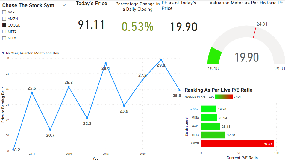
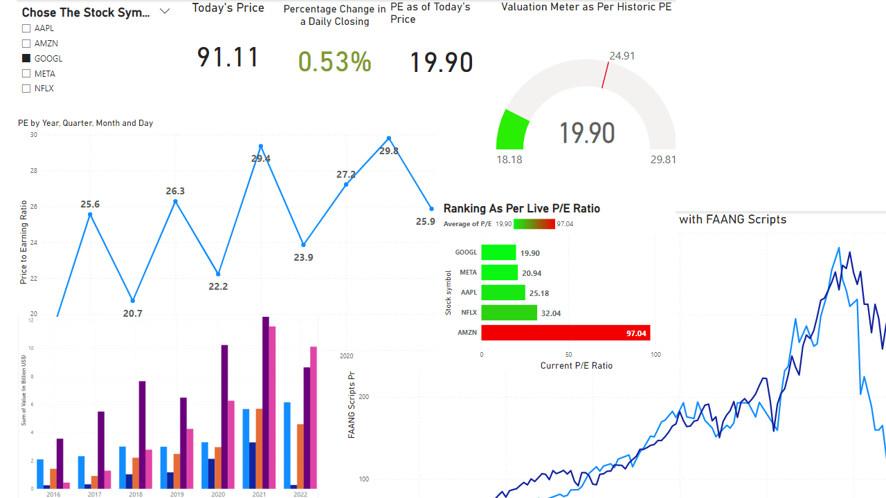
Live dashboard
Through my diligent efforts and technical expertise, I was able to uncover valuable insights into the financial and operational performance of the FAANG companies. One of the most striking observations was that being in the technology sector and viewed as the future, these companies tend to trade at a higher PE ratio. This is indicative of the market's forward-looking perspective on their potential growth and profitability. Additionally, I discovered that these stocks are highly correlated with each other and with the overall S&P index.
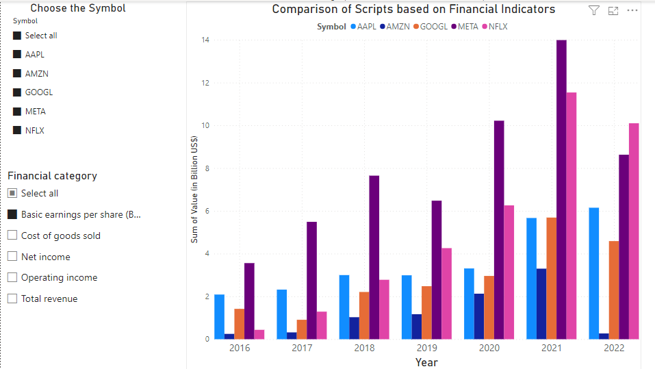
When it came to individual company performance, my analysis revealed that Amazon (AMZN) has been the leader in terms of overall revenue from 2019 to 2022. However, Netflix (NFLX) emerged as the leader in terms of earnings per share (EPS), overtaking Facebook (now Meta) in 2022. These findings offer valuable insights into the competitive landscape of the tech industry and can help inform investment strategies and decision-making.
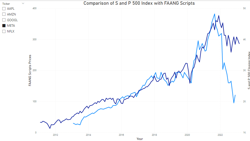
Corellation check between index and scripts
Overall, this project was a testament to the power of data analysis and visualization in uncovering insights and telling compelling stories. By leveraging my technical skills and strategic thinking, I was able to provide a comprehensive analysis of the FAANG companies that offers valuable insights for investors and analysts alike.
Overview of financial indicators